Normally, when a data mining practitioner is thinking of feature extraction and dealing with time series, will probably already know different indexing or segmentation approaches and heard of
- PCA (transformation to a lower feature space),
- PAA (use mean value of segments as features),
- DFT (use fourier coefficients for indexing),
- Spline Interpolation (coefficients),
- Regression (coefficients),
- Moving average (smooth approximation with less points),
- .... (and many others!)
for extracting important points of a dataset. Generally all methods which belong to the big topic dimension reduction. The reason behind this is the curse of dimensionality. Hence, some kind of transformation is applied to the dataset to map it to a new feature space of a lower dimensionality. Too many data points slowing down the computation time and leading very often to worse results.
Those algorithm approximate the structure of a dataset by removing points, transforming them, or calculating new ones from the intrinsic structure of the dataset. Only those points are removed which aren't "necessary" in that sense, they didn't carry much information. New single values are computed which carry nearly the same amount of information as a bunch of them. As mentioned before the aim is mainly to reduce the dataset as much as possible but at the same time remaining the information content.
Another possible application is the accurate determination of specific points in a curve to calculate specific values at that point. Often an automatic detection of such a process should be achived. In many cases this is very difficult because:
- Noise in the dataset -> many peaks in the dataset and often only one is important
- high sample rate / to many values result in a "shaky" / "woobly" line
But interdisciplinary applications of other fields can reveal also good approaches for that kind of problem solving. Methods in the field of Geomatic Engineering/Geoinformation and Cartography have another premise. It is not so much a question of intrinsic information, but rather visuell appearance and the speed of the visualisation of interactive maps. With other words: "The aim of line simplification is to reduce the number of points without destroying the essential shape or the salient character of a cartographic curve." (cf. here)
Geographic information in a rich data world have to be abstracted. Landmarks and borders have to be quickly captured by the user without displaying useless information with high level of detail. The experience showed that those methods in the field of line simplification revealing better characteristic in representing curves as other approaches - at least visually.
Therefore the resean of this article is to adapt those methods for dimension reduction and build a R package which doesn't exists at the time of writing based on my research. At the end of the article generally used methods for indexing time series are compared with line simplification algorithm techniques to measure their performance to answer the question: Can line simplifcation approaches also be used for dimension reduction?
Methods
Line Simplification Methods
This kind of methods don't create new points, or compute points in another feature space. They are actually very simple in their procedure: Removing unnessary points. The question is the way of achiving it.
n-Point removal
This approach is the most simple one to understand: The last and first point of a line is kept and every th point. Its fast calculation goes along with its bad representation of a line:
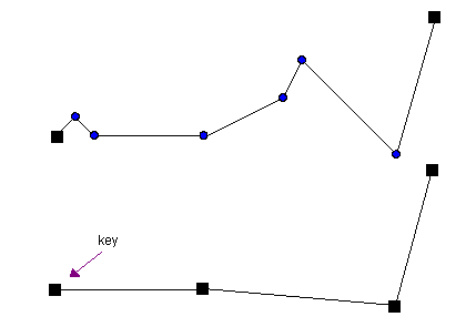 Source: http://psimpl.sourceforge.net/nth-point.html
RDP-algorithm
The Ramer-Douglas-Peucker-Algorithm is a more advanced approach to remove points of a line and simultaneously preserving the topology of the line. The pseudo code can be found on Wikipedia and is easy to understand:
function DouglasPeucker(PointList[], epsilon)
    // Find the point with the maximum distance
    dmax = 0
    index = 0
    end = length(PointList)
    for i = 2 to ( end - 1) {
        d = perpendicularDistance(PointList[i], Line(PointList[1], PointList[end]))
        if ( d > dmax ) {
            index = i
            dmax = d
        }
    }
    // If max distance is greater than epsilon, recursively simplify
    if ( dmax > epsilon ) {
        // Recursive call
        recResults1[] = DouglasPeucker(PointList[1...index], epsilon)
        recResults2[] = DouglasPeucker(PointList[index...end], epsilon)

        // Build the result list
        ResultList[] = {recResults1[1...length(recResults1)-1], recResults2[1...length(recResults2)]}
    } else {
        ResultList[] = {PointList[1], PointList[end]}
    }
    // Return the result
    return ResultList[]
end
Methods from Data Mining and Indexing of Time series
Important Points Selection
A minima and maxima extraction algorithm was proposed by Fink, and Pratt [Fink2004] and doesn't originated from the line simplification area. A series has an importent minimum
in the segment
if:
is the minimum in that segment
and
An important maximum exists if:
and
where is the compression rate factor. A minor modification is made by taking the absolute value when calculating the ratio between the endpoints of each segment and the extrem value. (to work also with negative values)
The following plots show some actual examples of the algorithms result. I created a normally distributed dataset with 40 points, . The window width for sliding through each segment was set to
. You can see that the amount of important points strongly vary with the parameter
. An increase of
results in the selection of fewer points [Fink2004]. Keep in mind that the sliding window width also determines the number of minima and maxima (not changed in this example).
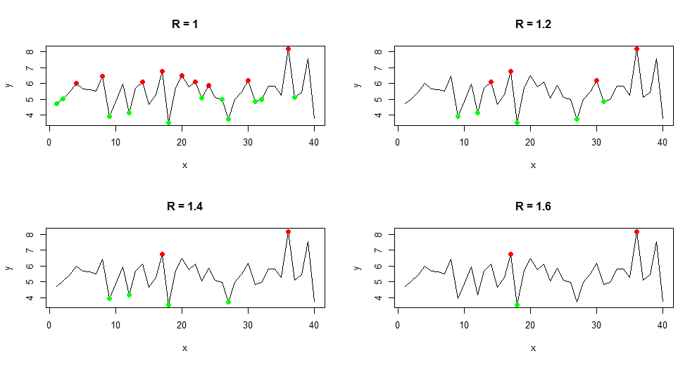 Important maximum points where marked as red and important minimum points are in green
PAA
PAA is the abbreviation for Piecewise Aggregate Approximation. It divides the dataset in equally sized segements and for each segment the mean is computed which serves as the approximation in this part of the dataset. (cf. InTechOpen)
Given a dataset , and its segment representation
, where each segment is
, the mean of a segment
is defined as follows:
The example below shows the level of detail of the approximation with different values for which defines the segment size
:
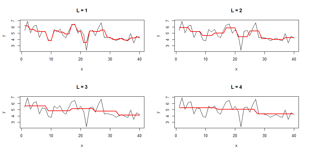 The mean values of each segment were replicated to achive a better visual representation.
The bigger the segment size the straighter the approximation because the mean of each segment is calculated over more values. If you choose a smaller segment size then the approximation gets more detailled. Alternatively you can choose directly. In that case you specifically define the number of points for the approximation. For example: if
then the line gets segmented into 6 parts and you'll get a approximation of 6 points for the whole line.
Evaluation and Comparison
For the test I used 3 different datasets:
- randomly normal distributed
- randomly uniform distributed
- Weather data (mean temperature of the day) of the city "Dresden" from 2016-05-23 to 2016-07-01
All in all each dataset consists of 40 observations. Weather data was collected using the R package weatherData.
After we have our test data and know some of the algorithms which are used for the feature selection we want to compare the performance of those. First, we need to define some similarity measures to compare two datasets and
with each other:
Second, we have to interpolate the "compressed" dataset for the comparison otherwise we can't use the defined similarity measures. We try to re-construct the original dataset from the compressed one. For that I'm using a simple linear interpolation for speed purposes and to take care not to polish the results. I want a understandable and basic comparison.
Furthermore, comparison works only if the number of extracted points are the same for every tested algorithm. For that the parameter eps of the RDP-Algorithm is adjusted to a degree that the number of extracted points where approximately the same as the outcome of the important points algorithm and PAA. Parameters for the IPA were and
(because of
) and for PAA, the parameter
was set to
. In the following you'll see the exact value of
for every dataset.
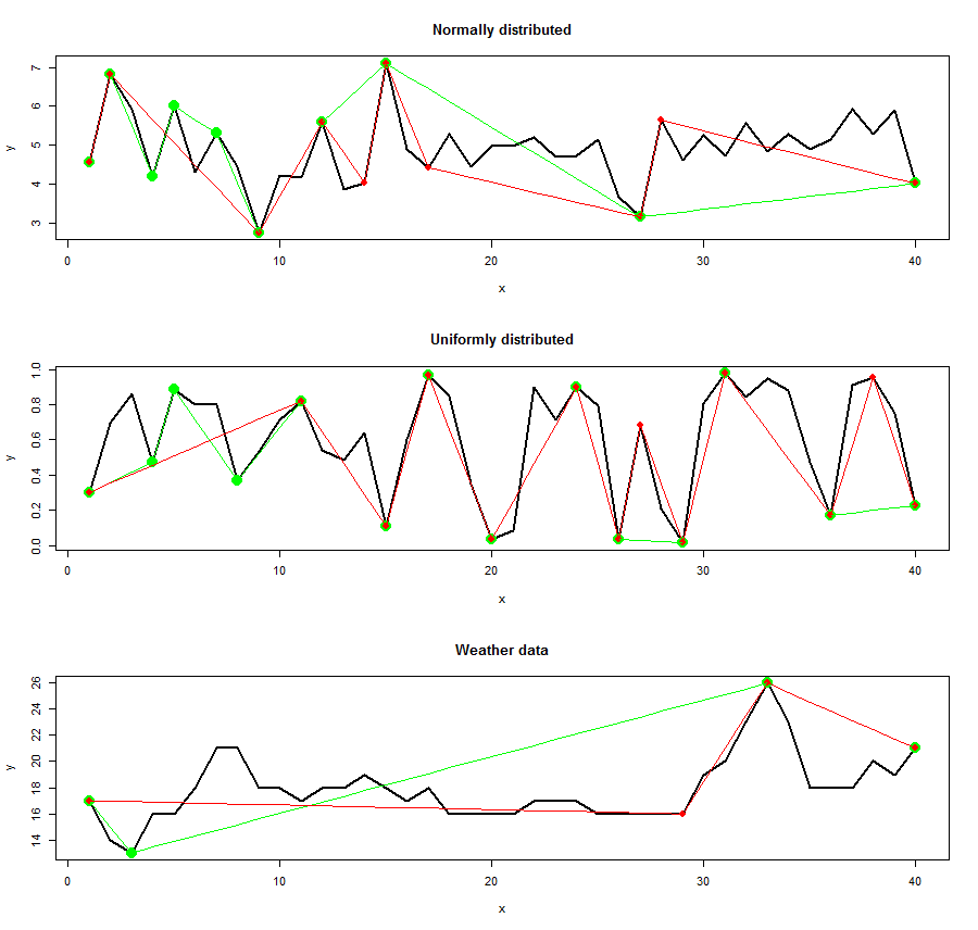
Visual Comparison
I compared always Important Points - RDP and PAA - RDP algorithm. The results for all datasets are depicted below:
 |
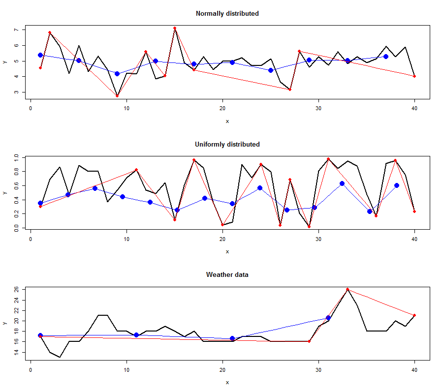 |
Red points indicate the result from the RDP algorithm whereas green and blue points indicate the IPS (left) and PAA (right) algorithm respectively. The points were connected to show the linear interpolated dataset computed with the selected features.
As you can see the location of points extracted vary strongly depending on the algorithm. The amount of points are different in every dataset too. That is the interesting and good part of the story. Now we would like to find out which extracted points carry more or "better" information regarding the reconstruction of the original line.
Detailed Analysis
The table below shows the accuracy of the algorithms. The mean difference and root mean squared difference where used to measure the similarity. Values near zero expressing that the interpolated dataset from the extracted points totally match with the original one. On the contrary higher values indicate a poor matching which means that the interpolated dataset doesn't represent the original dataset well.
|
mean difference |
rms difference |
|||||
|
|
IP |
PAA |
RDP |
IP |
PAA |
RDP |
|
Normally distributed |
0.94 |
2.10 |
0.62 |
1.20 |
1.90 |
0.83 |
|
Uniformly distributed |
0.17 |
1.20 |
0.18 |
0.28 |
1.10 |
0.25 |
|
Weather data |
3.50 |
6.00 |
1.50 |
4.20 |
5.70 |
2.30 |
At a first glance it can be noticed that the RDP algorithm performs in every situation better compared to the other two algorithms. The PAA has always the worst performance among the others and is not further mentioned here.
Not much improvement can be seen in case of the uniformly distributed dataset (4th row). In that case the IP and RDP are either equal (0.17 ~ 0.18) or the RDP algorithm performs only a fraction better (0.28 > 0.25).
To sum up, all algorithms don't represent the original dataset well except the uniformly distributed one with the RDP method.
Generalized Assessment
To use this line simplification algorithm for feature selection a generalized evaluation is necessary. Only then a more general applicability is realizeable. Nevertheless, an additional test is conducted in this short article. I created 20 normally distributed datasets . For each dataset the compressed representation was computed with IPS and RDP. Then the mean difference and rms difference were calculated between each original and compressed one. Afterwards the results were averaged. The table below shows the general performance:
| IPS | RDP | |
| mean diff |
1.10 |
0.71 |
| rms diff |
1.50 |
0.95 |
As you can see the RDP line simplification algorithm represents the original dataset much better than the IPS algorithm.
Final Words
This article serves only as a small guidance to use line simplifcation algorithm for feature selection. The tests performed in the short time available may not be significant and should stimulate to think more creatively. Try to generalise the results over more and different data samples. Can the same statements then be confirmend as well?
All results can be verified using the R code under the following github link: here.
Feel free to contact me if you see any errors.
References
- Fink2004: Eugene Fink and Kevin B. Pratt, Indexing of compressed time series, Data Mining in Time Series Databases, 2003, pp. 51-78, World Scientific
- PAA: Description of the PAA algorithm
- RDP-Algorithm: Good introduction on Wikipedia with pseudo code
- weatherData: R package to get weather data